Ounass
When your delivery promise is three hours, a bad address form is not a UX problem. It’s a business crisis.
Ounass is the Gulf’s leading luxury fashion platform, operating across the UAE, Saudi Arabia, and Kuwait. It is not just fast delivery — it is same-day, under-three-hours delivery on orders that can reach thousands of dollars. That promise is the product. It is what separates Ounass from every other e-commerce player in the region, and it is what high-value customers come back for.
But that promise was quietly breaking. Up to 15% of deliveries in Saudi Arabia were being returned to origin. Drivers would arrive at an address that didn’t match anything real on the ground. Orders were canceled, refunds were issued, and customers who expected white-glove delivery were calling support teams instead. With over $650M in annual orders, even a small percentage of failed deliveries was absorbing an enormous amount of money, staff time, and customer trust.
The brief was to fix the address capture flow. But fixing the form was never the real job.
-50%
Drop in Return-to-Origin rate in Saudi Arabia after launch
-30.5%
Reduction in order cancellations directly linked to address failures
+1.3%
Increase in checkout conversion — at Ounass scale, a significant number
Role: Senior Product Designer
Platform: Mobile Web and Native App
Markets: UAE, Saudi Arabia, Kuwait
Teams: Product, Engineering, Ops, Logistics, Support

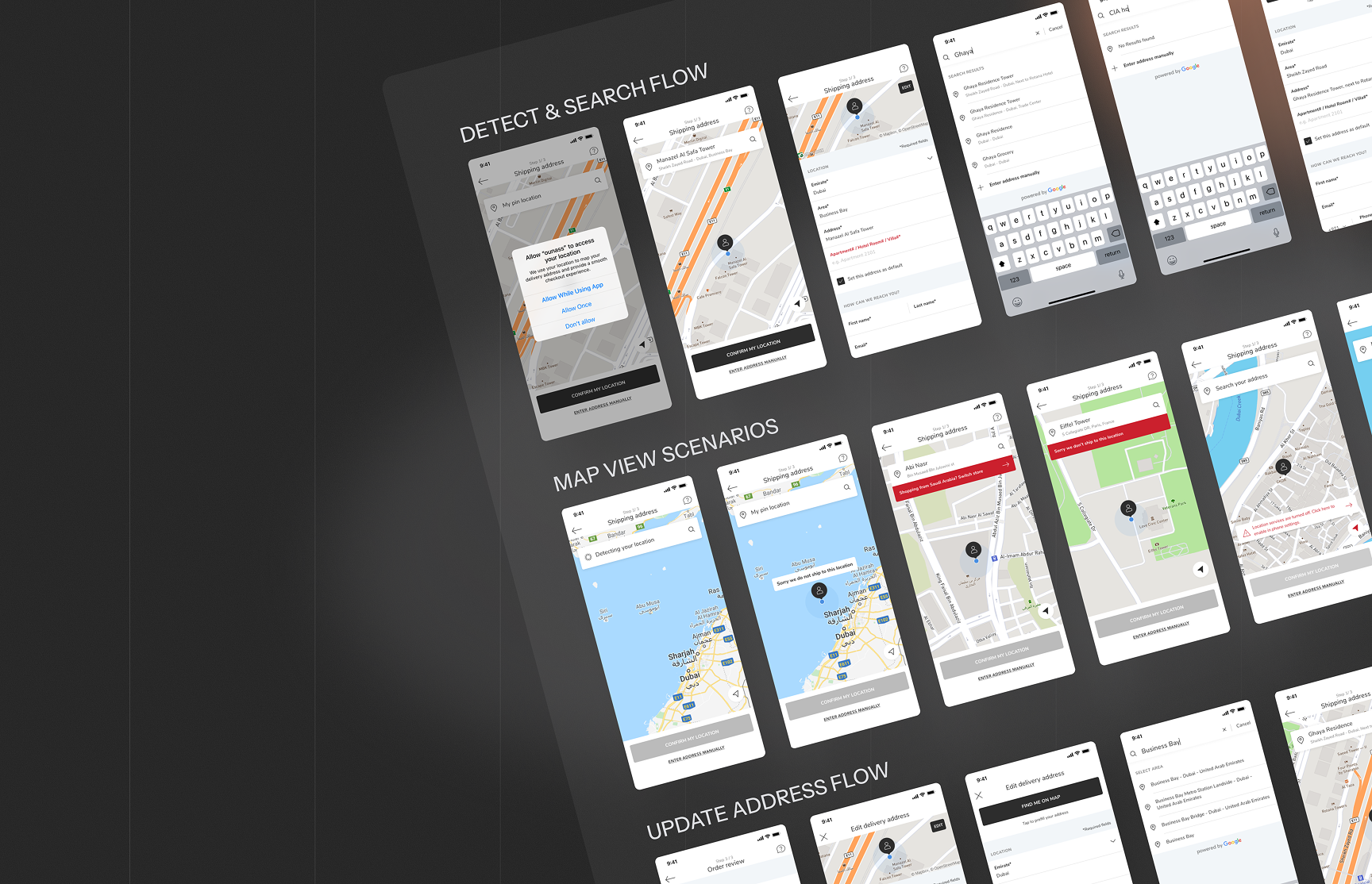
The address form worked. The mental model behind it didn’t.
Street addressing in the Gulf does not work the way it does in Europe. In Saudi Arabia and the UAE, many areas lack consistent street names or building numbers. People navigate by landmarks, by district, by proximity to something recognizable. When a user is asked to fill in a street name and postcode, they are being asked for information they do not have, or that does not meaningfully exist for where they live.
The existing form was technically functional. Users could submit it. But the data coming through was unreliable: apartment numbers missing, street names invented, addresses that were geographically close but logistically wrong. The gap between what users submitted and what drivers needed to find them was causing a cascade of downstream failures, missed deliveries, support calls, and manual WhatsApp follow-ups.
The problem was not a bad form. It was a fundamental mismatch between how people in the Gulf describe where they live and how the checkout flow expected them to explain it.
Solving that required understanding the behavior first, not the UI.
Senior Product Designer
I owned the design of the new address capture experience across mobile web and the native app. But the more important part of the work happened before any screen was opened: reframing what the problem actually was, and building the evidence base that would justify a fundamentally different approach to how we captured location.
Problem reframing and research direction
I ran user research across KSA and UAE to understand how people in the region conceptualize location and describe where they live. Rather than asking why users were filling in forms incorrectly, I asked what mental model they actually had and designed from there. Research included user surveys, stakeholder interviews with logistics, ops, and support teams, competitive analysis across food delivery and ride-hailing apps, and a deep review of RTO and support ticket data.
Strategic rollout design
Rather than pushing for a full launch, I proposed a phased approach: start with mobile web in Kuwait, lower risk, good order volume, representative behavior. Test map-based input against manual entry in a live A/B. Collect real data before committing to a platform-wide architectural change. This framing gave product leadership the confidence to move forward without betting everything on an untested concept.
Map-led checkout experience
Designed the full map-based address capture flow: location permission, GPS detection, pin placement, confirmation, and structured supplementary fields. The flow replaced the assumption that users could provide accurate street-level data with a system that let GPS do the precision work, and let users describe the details that mattered for their door.
Manual fallback and validation
Not every user would allow location access, and not every region had reliable GPS precision. I designed a manual-entry fallback using Google Places autocomplete, landmark-aware search results, and validation to catch incomplete addresses before they reached the logistics system. Both paths had to be trustworthy; the fallback could not feel like a compromise.
Cross-functional alignment
This project touched logistics, customer care, engineering, and marketing, all of whom had strong opinions about what the address problem meant and what the solution should be. I ran alignment sessions early and often, ensuring design decisions were grounded in operational reality, not just user research. The support and logistics teams became advocates for the solution because they had helped shape it.
Designing for a context that most checkout flows are not built for.
The starting point was JTBD. I reframed the user’s primary job not as ‘fill in my address’ but as: when I am ordering something expensive and urgent, I need to know it will reach me, without having to explain where I live. That single reframe changed everything. It shifted the design question from ‘how do we make this form easier to complete’ to ‘how do we remove the burden of explanation entirely?’
The answer was GPS-first. A map that detects the user’s location, drops a pin, and auto-populates the structured fields. Users confirm what the system has captured rather than constructing an address from scratch. The cognitive load drops significantly, and data quality improves because GPS accuracy is not dependent on a user knowing their postcode.
But GPS alone was not enough. Two things could break it: users who refused location permissions, and buildings that GPS would place incorrectly or imprecisely. The autocomplete fallback handled the first. Supplementary fields, apartment number, floor, building name, and landmark notes handled the second. These were not nice-to-haves. They were the difference between a pin on a map and an address a driver could actually use.
The phased launch to Kuwait on the mobile web was a deliberate containment strategy. A/B testing map vs manual input in a live environment gave us a signal that no usability test could provide: real completion rates, real delivery outcomes, real support ticket volumes. When the data came back clearly in favor of the map experience, rolling out to Saudi Arabia and the UAE had a much stronger business case.
A checkout that reduced failed deliveries by half, and rebuilt confidence in a promise the platform was built on.
50% reduction in Return-to-Origin rate in Saudi Arabia, the market with the highest previous failure rate
30.5% drop in order cancellations directly attributed to address-related delivery failures
5.26% improvement in average delivery time, as drivers spent less time trying to locate ambiguous addresses
1.3% increase in checkout conversion — marginal as a percentage, substantial at Ounass order volumes
Significant reduction in support ticket volume related to delivery failures, freeing internal teams from manual follow-up
Phased rollout model validated: Kuwait learnings directly shaped the Saudi and UAE launch, reducing risk at each stage
The UX problem and the operational problem were the same problem.
This project reinforced something I strongly believe: design decisions that look small on a screen can have large downstream consequences. The error message that told a user their address was incomplete before checkout, not after a failed delivery, was a single moment in a flow. But it prevented a support call, a refund request, and a driver arriving at the wrong building. At scale, that single moment was worth more than a dozen polished screens.
The research also challenged an assumption I carried into the project. I expected the GPS map to win because it was easier. It won because it was more trustworthy. Users in the region had been burned by delivery failures before. Seeing a pin placed accurately on a map of their neighborhood gave them confidence that the system understood where they were. That confidence mattered as much as the accuracy. Trust is a design problem too.
The phased launch was the right call, not because we lacked confidence in the solution, but because good confidence is built on evidence, not instinct.
Starting with Kuwait on mobile web, with a live A/B test against manual input, meant that when we asked leadership to commit to a platform-wide change, we were not asking them to trust a design. We were showing them data. That shift from presenting a design to presenting a case is one of the clearest differences between mid-level and senior design work. The screens are a small part of it.
