Klarna
From payment to a full shopping destination.
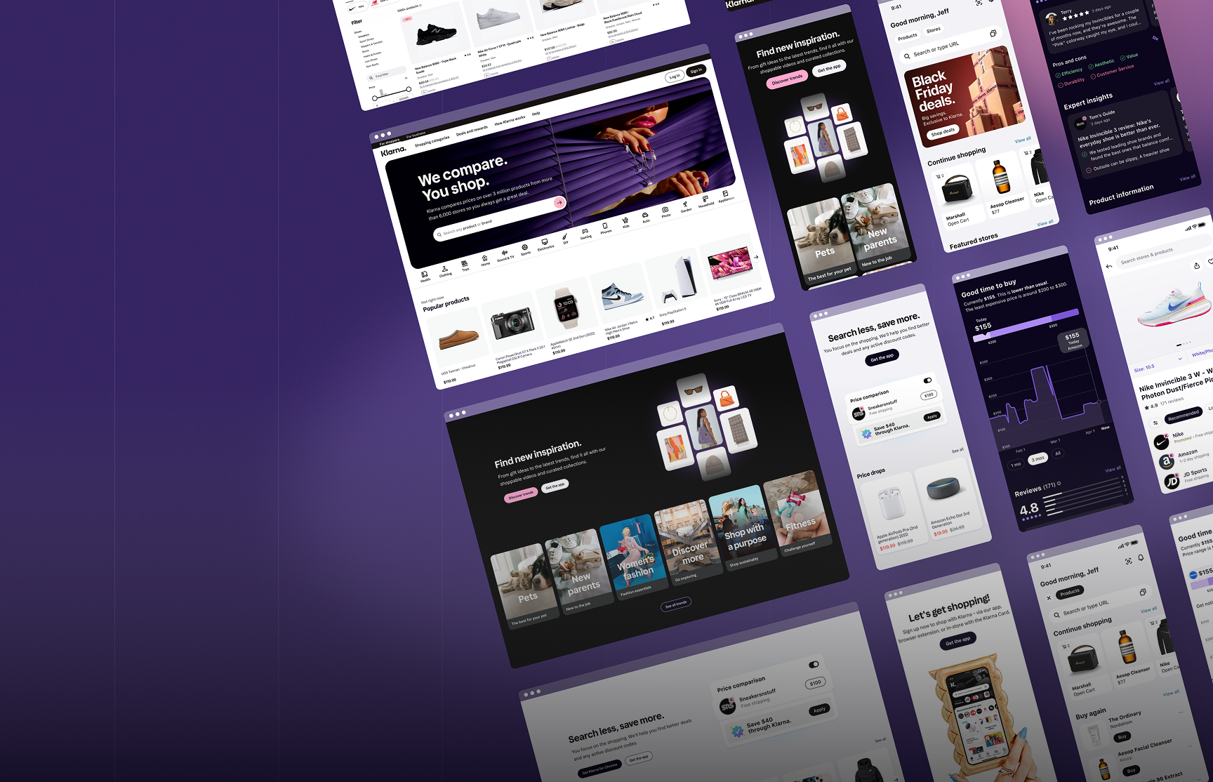
Klarna is one of the world’s leading payment platforms, best known for its Buy Now, Pay Later service. With over 150 million users and 400,000 retail partners globally, it had already built a dominant position in how people pay online. But paying is only one part of shopping. Klarna wanted to own the full journey: discovery, comparison, browsing, and purchase, all within one product.
To make that real, Klarna acquired PriceRunner in 2022. PriceRunner is a price-comparison platform with deep roots in the Nordics—a tool that millions of people use to research products, compare prices across retailers, and make informed purchase decisions. It is trusted, category-rich, and built for a fundamentally different behavior than Klarna’s existing experience.
My role was to design the shopping experience that would make this vision work—connecting discovery to payment and integrating PriceRunner’s capabilities into Klarna’s ecosystem without losing what made either product valuable.
+25%
Increase in user engagement after redesigning product discovery
+15%
Increase in returning users, retaining PriceRunner’s established base
Global
Shopping experience rolled out across markets, with strong Nordic presence

Klarna and PriceRunner were built for different people doing different things.

Klarna users come to pay. The experience was designed to be fast, frictionless, and light. PriceRunner users come to research. They want depth—filters, comparisons, specs, and price history. These are not the same person, and they are not in the same mindset.
Bringing PriceRunner’s catalog into Klarna meant introducing tens of millions of products into an environment that was never designed for that scale or the complexity of decision-making. Done wrong, it would overwhelm Klarna users and frustrate PriceRunner’s loyal base in the Nordics—who rely on the depth and transparency that the platform was built on.
The challenge was not building a bigger navigation. It was making one product serve two fundamentally different shopping behaviours.
That required rethinking how users enter, move through, and complete their journey—from the moment they arrive to the moment they pay.
Senior Product Designer
I led design across the core surfaces of Klarna’s shopping experience. My work sat at the intersection of product direction, design systems, and cross-functional alignment—shaping not just how things looked but also how the underlying structure would work.
Navigation experience
Owned the navigation architecture—from top-level category structure to deep browsing paths. Ran user research, facilitated cross-functional workshops, and drove iterative testing to find a structure that served both Klarna’s light browsing behavior and PriceRunner’s depth-first discovery.
Search and product pages
Designed the search experience and product detail pages, ensuring that PriceRunner’s comparison capabilities were embedded natively into Klarna’s flow—not bolted on as a separate layer.
Design system alignment
Contributed to aligning the Klarna and PriceRunner design systems, ensuring visual and interaction consistency across two products with separate foundations.
Team alignment and direction
Facilitated workshops with product, engineering, research, and data teams across both companies to align on structure, priorities, and constraints. Brought design decisions to product leadership with a clear rationale.
Making the architecture work before touching the UI.
Before any screens, I mapped how PriceRunner’s category taxonomy related to Klarna’s existing shopping hierarchy. The gaps were significant: product types that PriceRunner surfaced prominently had no real home within Klarna’s structure. Others overlapped in ways that would confuse users without deliberate naming and grouping decisions.
I ran interviews with users across both products. What I found was a mismatch in mental models, not a preference problem. Klarna users scanned broadly and moved fast. PriceRunner users were deliberate—they arrived with a product in mind, used filters heavily, and needed comparison to feel trustworthy rather than decorative. Understanding that distinction changed the design direction.
I worked in structural concepts before moving to UI—each concept making a different bet on how much complexity to expose at the top level, how to handle the transition between light browsing and deep comparison, and where PriceRunner’s identity should live within Klarna. These were strategic questions with design answers, and they needed to be resolved before pixels mattered.
A shopping experience that made discovery and payment feel like one journey, not two products stitched together.
Unified product discovery, comparison, and browsing within Klarna’s ecosystem across multiple global markets
Navigation architecture scaled from light browsing to deep comparison without fracturing the experience
PriceRunner’s comparison capabilities embedded natively, retaining the trust and depth its users expected
Design system aligned across Klarna and PriceRunner, enabling consistent experience and faster future iteration
25% increase in user engagement following improved product discovery
15% increase in returning users, retaining PriceRunner’s established base in the Nordics
The design problem and the organisational problem were the same problem.
The navigation I designed only worked because the decisions shaping it were made collaboratively with engineering, research, and product leadership across both companies. Getting those decisions made required being in the right rooms and asking the questions that others were avoiding.
One of the clearest lessons from this project: when testing showed that no single navigation version could win on both discoverability and comparison depth, the instinct was to split the difference. I pushed back. A layered approach, a simplified entry point with a clearly signposted route into deeper browsing, was harder to align on, but significantly better for users on both sides.
Making that argument to product leadership, with evidence and a clear articulation of the tradeoff, was as much a part of the design work as building the concept itself.
Senior design is not more polished screens. It is knowing which questions cannot be skipped—and being the person who asks them.
This project also changed how I think about acquisitions as a design problem. Merging two products is really about merging two teams with different users, different values, and different definitions of what good looks like. The designer’s job in that context is not just to make things look coherent. It is to find the logic that makes coherence possible.
